About Me
- Tonya
- Hiya I'm Tonya! I'm an avid psper, have been for a few years and finally have me a blog that I've been working on slowly getting stuff added to. I started writing tuts and recently started making masks and templates. I LOVE to see creations you've made with my things, if you'd like to email me please do so at aquaspinner@gmail.com ................................................. My TOU are as follows: All of my items are personal use only NO Commercial Use, please do not share (distribute) my stuff in groups, just send people here to grab please. ♥ Tutorial writers, if you wish to use my stuff in your tutorials, of course I am honored! You're more than welcome to use my stuff in them, I only require that you link to me and send people here to grab the goodies that you are using in the tut. ................................................. Hope you'll enjoy what I have for ya and thanks for stopping by. ♥
My Artist CTs ♥

My CTs ♥


My Guest CTs ♥

Wednesday, September 29, 2010
Rockitudeness

• Tube I used was by Ted Hammond which I purchased from CILM. Please do not use this art without an appropriate license to do so. This tube is now available for purchase at CDO here.
• Mask I used was one of Vix' fabulous ones and you can get from her site I used Vix mask 278.
• I used the scrapkit by the very talented Tina of Tina's Magical World called I Love Music and it is available for purchase here. Fabulous kit hon! Very fun to work with. ♥
• Template by Missy of Divine Intentionz I used Template 375, thank you so much for the awesome templates hon!
• Filters I used were: Toadies What Are You, Xero Porcelain, Super Blade Pro (coconut ice preset), Eye Candy 4000 Glass, Eye Candy 4000 Gradient Glow, and Eye Candy 5 Perspective Shadow.
• Font used was Lorelei Script, but use whatever font you wish.
Okay ready, let's go, make a easy yet adorable tag!
• Open up Missy's fabulous template, duplicate and close out the original so you can re-use again later if you like. I unhid the white background layer and changed the canvas size to 800x600, I like to have lotsa room to work lol! You may need to flood fill that white background layer. I deleted the credits layer of the template. Okay lets work from the bottom up on the fab template!
• On thin rectangle layer, I used my manual color correction tool, choosing black as the Source color and changed the Target to #54adb1. On the wordart layer, I used the color correction tool again and changed the pink (source) to #e0f3f9 as the target. On the dotted line layer, I again used color correction and changed that pink as the source to #ffc1e6 as the target.
• On the rectangles layer, I did select all, float, defloat, invert selections and paste paper of choice as a new layer. I used paper 12, re-size as necessary and press delete and select none. On the circle 1 and circle 2 layers, I used the manual color correction tool to change the current pink color on those layers (source) to #54adb1 as the target. Do this on both layers. On the thin rectangles 2 layer, select all, float, defloat, invert selections, paste paper of choice as a new layer and press delete after re-sizing paper if need be. Select none.
• On oval layer, select all, float, defloat, invert selections and paste paper of choice as a new layer, I used paper 15. Resize as necessary and press delete and select none. On the circle center and oval frame layers, I used the manual color correction tool to change from the darker pink color to the lighter pink one used earlier.
• On the wordart layer (the Rockitudeness baby one), using my magic wand tool, I clicked inside the black text areas of the Rockitudeness word. You may need to zoom in a bit to see real good. Once you have all the parts selected you want, I used the manual color correction tool to change the black color to #54adb1. Looks good I hope? With things still selected, I did a weave effect as the weave there doesn't show up as prettily anymore with changing the color like that. See print screen below for my settings:

• On frame layer, select all, float, defloat, add a new layer and I flood filled with a created gradient of the light pink and light blue colors using the foreground-background gradient. Or if you prefer use a paper or another gradient of choice. If happy, select none. On the frame layer, I used the manual color correction tool to change the color from white to the teal color used above. Once that's done I just applied an inner bevel setting to give it a gel-like effect. Now hopefully the template looking really pretty yes?
• At this point, I changed the canvas size to reallllly huge so that I could see if any layers had 'overhang' as we need to remove that if they do. Reason for this is when we do drop shadows and stuff if the overhang stuff not removed it might give your finished tag a funky glow. To remove the overhang what I did was take my selection tool, set to rectangle and find the layers they are on and selecting the parts I want to delete and then press delete. Select none and once done put your canvas size back at the 800x600.
• Okay now what I did is add my gradient glows to certain layers. As you can see in my tag, the various rectangle and circle layers. It's all personal choice how you choose to do those, I usually use Eye Candy 4000 with a setting of about 4, 25, 100 on the first tab and on the second I choose the "fat" setting and change my colors from there. Now lets add the tube of course! I just kinda positioned her above the frame and had wordart above.
• At this point I added some fab elements to the tag, there are soooo many to choose from in this rockin' kit, I had a hard time deciding which to use lol! At this point I re-sized my tag to how I want my ending tag to be and sharpen any layers that need it. Add the artist's copyright and your tagger's watermark if you use one.
• With the tube layer, I duplicated, and on the top copy changed the blend mode to Overlay. On the bottom (original) tube layer I applied Xero Porcelain. Add drop shadows to all layers that need it. I used the filter Eye Candy 5 Perspective Shadow but if you don't have the filter the Drop Shadow feature within PSP works just as great!
• On the white background layer, add a new layer and flood fill with gradient we created earlier (or if you prefer paper of choice or other gradient of choice). I applied Vix' fab mask and merged layer group. I applied filter of Toadies What Are You with the default settings. One thing with that filter, I always have it set to white on the background before applying. If you don't you might have some interesting blurs on it lol. I duplicated the layer a few times to darken it up some and merging them down until they were one layer and then duplicated and mirrored and once again merging down so that all the mask layers are together. Those steps only necessary cuz I used such a light colored gradient it may not be necessary depending on the colors you used.
• Phew! Almost done. All that is left now is to do your text. What I did is used Lorelei Script with Super Blade Pro (coconut ice) setting and then applied Eye Candy 4000 Glass, then Eye Candy 4000 Gradient Glow and of course a subtle drop shadow. Just hide the white layer and save as a png and voila all done!
This tutorial was written by Tonya on September 29, 2010, absolutely no part of this tutorial may be taken or used without my express permission. Any part that may be similar to any tutorial is purely coincidental and unintended.
Tuesday, September 28, 2010
Okay this is NOT a tag tutorial. Many people have asked me to tut how I use Super Blade Pro in the text of my tags cuz it usually looks pretty shiny lol so I'm going to give this a whirl! I'll just use example on making text cuz it's eay. First things first gotta have the filter! You can get it at Flaming Pear the makers of the filter. It does come with I think its a 30 day free trial and then you do have to purchase it. It's one of those filters that I definitely think is worth the money lol.
Okay so you've got the filter and you just install it like any other filter. Never ever install filters directly to your PSP Program Files. I always put all my 'psp stuff' on my external hard drive. I created a folder called My PSP Files and then a subfolder for Plugins and then of course each filter has a folder in there including my Super Blade Pro. Now when you download you should see your 8bf folder and also you'll see a folder called environments and textures and also one for images. Important stuff for later.
Next thing you wanna do is have some presets added in. SBP does come with some generic presets and those are fine but there are some that are in my opinion BETTER lol! Here's a couple of links to some awesome presets. When you download presets, you need to put them in the environments and textures folder. The program will not work if you don't! Okay here's some links and these are free presets and who doesn't love free???
http://www.meadowsstudio.com/ has freakin' awesome ones especially the coconut ice one which I use A LOT, the other ones are really cool too
http://www.essexgirl.uk.com/sbp_presets-index.htm another really great one, sorted by color and if you're a hoarder like me you'll love these haha
another set I love but don't know about the sharing rules on them so unfortunately I cannot share are the 'kris' ones. But the above two will get you started!
Okay so I've opened up a new canvas, add a new layer for your text and I'm choosing a nice fat scripty font called Applejuiced. Sometimes the thinner fonts don't tend to work that great with the super blade pro effect. Typing out my name nice n big and some of the effects I find works best using white text, which is what I'm going to do for this example and using one of the Meadow Studios ones, called Blue Patriotic cuz well I feel blue today lol.
At this point you should see basically just marching ants around the name and the white text. I also create my text as floating. If you are a vector creating text PSPer, convert to raster layer, select all, float and defloat. You must have marching ants around the text for the plugin to work appropriately. Now we want to use the plugin yahoooooo. Go to Effects and find Flaming Pear and then Super Blade Pro you should get the following screen:
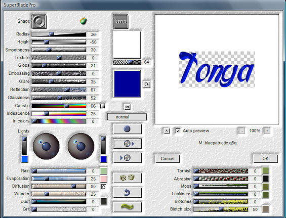
Now let's talk about this screen lol. You'll see the name of the preset I'm using M_bluepatriotic. Basically it remembers the last one used and often shows you a preview of what your selection will look like. If you're using the same as previously just click okay but if you want to change it, you need to click on the red box in next example:

Clicking that box opens up all your preset choices. Me I have a LOT of presets. I fully admit to being a preset ho! You can generally see a preview in there as well as you're flipping through them. Some people tend to sort theirs by color. I don't do that mostly cuz I'm too darned lazy to go in and do so lol. The box underneath the one I selected is to save a preset if you've made one. I've never done that nor have I changed any of the settings on the presets. It's easier to colorize if need be later. Now sometimes you want to look at different bevels, you can do that by clicking on the 'shape' in the upper left area there. You'll see there are about a dozen or so different options. On the one I have selected it's using the second from bottom shape, but you'll see what clicking different ones does to the previews as you try them. For example the very bottom one pretty much takes out the bevel. Not one I use most times! When happy just click okay that's all there is to it! The other buttons in there I don't really touch ever.
Now some tips/observations if you like to hear em. You can do this filter not just with text but also with perhaps elements in the templates you use to make tags or sometimes even wordart works good with the effect too.
If you haven't used the preset before it may ask you to find a particular file, the image file associated with the preset. It should be within that same folder, or possibly in the images folder, but generally I put everything in the environment and textures folder easy peasy to find then.
Sometimes the color doesn't come out just right. 2 ways to handle this, either change the color you used when you created your text, or after you've applied the preset you can use either the colorize option or the manual color correction tool. Play around with different colors and stuff you'll have a lot of fun with the turnout effect.
After I'm done applying the filter I just select none and often apply a gradient glow and a drop shadow. Sometimes I also use EC 4000 Glass after the SBP effect to make it super glassy lol. It's all style points and how you want to create your text, just have fun with it!
This tutorial was written by Tonya on September 28, 2010. This is my own how to and any similarity to any other is completely unintentional. Please do not copy, rip apart, or re-distribute my tutorial in any way without my express permission.
Okay so you've got the filter and you just install it like any other filter. Never ever install filters directly to your PSP Program Files. I always put all my 'psp stuff' on my external hard drive. I created a folder called My PSP Files and then a subfolder for Plugins and then of course each filter has a folder in there including my Super Blade Pro. Now when you download you should see your 8bf folder and also you'll see a folder called environments and textures and also one for images. Important stuff for later.
Next thing you wanna do is have some presets added in. SBP does come with some generic presets and those are fine but there are some that are in my opinion BETTER lol! Here's a couple of links to some awesome presets. When you download presets, you need to put them in the environments and textures folder. The program will not work if you don't! Okay here's some links and these are free presets and who doesn't love free???
http://www.meadowsstudio.com/ has freakin' awesome ones especially the coconut ice one which I use A LOT, the other ones are really cool too
http://www.essexgirl.uk.com/sbp_presets-index.htm another really great one, sorted by color and if you're a hoarder like me you'll love these haha
another set I love but don't know about the sharing rules on them so unfortunately I cannot share are the 'kris' ones. But the above two will get you started!
Okay so I've opened up a new canvas, add a new layer for your text and I'm choosing a nice fat scripty font called Applejuiced. Sometimes the thinner fonts don't tend to work that great with the super blade pro effect. Typing out my name nice n big and some of the effects I find works best using white text, which is what I'm going to do for this example and using one of the Meadow Studios ones, called Blue Patriotic cuz well I feel blue today lol.
At this point you should see basically just marching ants around the name and the white text. I also create my text as floating. If you are a vector creating text PSPer, convert to raster layer, select all, float and defloat. You must have marching ants around the text for the plugin to work appropriately. Now we want to use the plugin yahoooooo. Go to Effects and find Flaming Pear and then Super Blade Pro you should get the following screen:
Now let's talk about this screen lol. You'll see the name of the preset I'm using M_bluepatriotic. Basically it remembers the last one used and often shows you a preview of what your selection will look like. If you're using the same as previously just click okay but if you want to change it, you need to click on the red box in next example:
Clicking that box opens up all your preset choices. Me I have a LOT of presets. I fully admit to being a preset ho! You can generally see a preview in there as well as you're flipping through them. Some people tend to sort theirs by color. I don't do that mostly cuz I'm too darned lazy to go in and do so lol. The box underneath the one I selected is to save a preset if you've made one. I've never done that nor have I changed any of the settings on the presets. It's easier to colorize if need be later. Now sometimes you want to look at different bevels, you can do that by clicking on the 'shape' in the upper left area there. You'll see there are about a dozen or so different options. On the one I have selected it's using the second from bottom shape, but you'll see what clicking different ones does to the previews as you try them. For example the very bottom one pretty much takes out the bevel. Not one I use most times! When happy just click okay that's all there is to it! The other buttons in there I don't really touch ever.
Now some tips/observations if you like to hear em. You can do this filter not just with text but also with perhaps elements in the templates you use to make tags or sometimes even wordart works good with the effect too.
If you haven't used the preset before it may ask you to find a particular file, the image file associated with the preset. It should be within that same folder, or possibly in the images folder, but generally I put everything in the environment and textures folder easy peasy to find then.
Sometimes the color doesn't come out just right. 2 ways to handle this, either change the color you used when you created your text, or after you've applied the preset you can use either the colorize option or the manual color correction tool. Play around with different colors and stuff you'll have a lot of fun with the turnout effect.
After I'm done applying the filter I just select none and often apply a gradient glow and a drop shadow. Sometimes I also use EC 4000 Glass after the SBP effect to make it super glassy lol. It's all style points and how you want to create your text, just have fun with it!
This tutorial was written by Tonya on September 28, 2010. This is my own how to and any similarity to any other is completely unintentional. Please do not copy, rip apart, or re-distribute my tutorial in any way without my express permission.
Sunday, September 19, 2010

This is the tag we'll be making so, here's what you'll need:
• Tube I used was by Shawli which I purchased from My PSP Tubes. Please do not use this art without an appropriate license to do so.
• Masks I used were Creative Misfits I used Devilish Mask 2 by myself lol and also Aqua's mask 94 (awesome mask hon thank you!).
• I used the scrapkit by the very talented Connie of Connie's Creative Chaos called Orange you glad I didn't say Banana and it is available for purchase here. Fabulous kit hon! Very fun to work with. ♥
• Filters I used were: Xero Porcelain, Super Blade Pro (coconut ice preset), Eye Candy 4000 Gradient Glow, and Eye Candy 5 Perspective Shadow.
• Font used was Loyal Fame and is available at daFont, but use whatever font you wish.
Okay ready, let's go, make a easy yet adorable tag!
• Open up a new canvas 700x700, be sure that if you are using PTU art that you have your image resolution set no higher than 72 in accordance with TOU. Open up Orangeframe element and paste onto your blank canvas. I rotated to the left by 90° and re-size to your liking, I re-sized mine by about 80%. Copy and paste tube on top of the frame, see placement on my tag, I re-sized the tube by about 85%.
• Click inside the frame layer with your magic wand tool and expand selection by about 10 pixels. Open up Orange Paper 3, mirror, and then underneath the frame layer, paste the paper as a new layer. I re-sized the paper by 70%. Invert your selections and press delete to remove the excess paper from hanging over the frame. Select none.
• Underneath the paper for inside the frame, copy and paste Orange Doodle 9 as a new layer. I re-sized the doodle by about 80% and rotated to the left by 7°. With your mover or deform tool place to the upper left of behind the frame. Once happy, duplicate the layer, and mirror and flip. You should see the pretty doodle behind the whole frame now. See my tag for reference.
• On the white background layer, add a new blank layer and select all. Paste paper of choice into selection on the newly created layer, I used Orange Paper 80. Select none and apply AR Mask 94. Then make sure you either merge layer group OR you can just have the group-raster 4 layer selected and then apply the Devilish Mask 2 by me. Once happy with how they look, merge layer group. I re-sized that layer by 95%.
• Decorate your tag with elements of choice, I used a bow and also the orchid vine. So many elements in this luscious kit! Crop the tag to remove the excess out of it and then at this point I re-sized my tag to how I want it to be in the end. At this point, I sharpened the tube layer, duplicated and on the top copy applied a gaussian blur of about 5 and changed the blend mode to Soft Light. On the original (bottom) tube layer, I applied Xero Porcelain just to give the tube a pretty glow.
• Add your drop shadows if you like at this point. I pretty much drop shadow everything except the mask layer lol! I use Eye Candy 5 Perspective Shadow but if you don't have this filter you can just as easily use the drop shadow within psp. At this point add the artist's copyright and also your tagger's watermark if you use one. All that is left is to do the text woohoo! I used Loyal Fame but there are so many fonts out there just use your fave lol. I used an orange color from my tag (#fda21a) and applied Super Blade Pro coconut ice setting. If you do not have this filter, you can get glass like effects using inner bevel and Eye Candy 3 Glass (that is a free filter). Then I just applied a gradient glow I made using the green and orange colors and of course a drop shadow.
• Now just close off the white background layer, and save as a png and voila all done! I hope you've enjoyed this very easy tutorial.
This tutorial was written by Tonya on September 19, 2010, absolutely no part of this tutorial may be taken or used without my express permission. Any part that may be similar to any tutorial is purely coincidental and unintended.
Thursday, September 9, 2010

This is the tag we'll be making so, here's what you'll need:
• Tube I used was by Ismael Rac which I purchased from his store. Please do not use his art without an appropriate license to do so.
• Template I used is by Sylvie and Kristin and you can get it here on Kristin's blog thank you ladies for the awesome temp!
• Mask I used was from myself actually lol, you can get them here I used mask 2 & 9.
• I used the scrapkit by the very talented Tamie of Addictive Pleasures called Mermaid and it is available for purchase here. Any kit you want to use will do.
• Filters I used were: Tramages Pool Shadow, Xero Porcelain, Super Blade Pro (coconut ice preset), Eye Candy 4000 Gradient Glow, and Eye Candy 5 Perspective Shadow.
• Texture of choice, the one I used was here, please do not rename if you choose to use. You should be able to just right click and save.
• Font used was Fiona Script, but use whatever font you wish.
Okay ready, let's go, make a fab tag! It's a lil wordy but that's my way sometimes lol!
• Open up Sylvie and Kristin's template and duplicate and close out the original. Unhide the Raster 1 layer and delete the © layer. I pretty much left all the layers where they were except that I moved the Pixel Words to the top of the gradient layer. See my tag for reference, it will just depend on your liking and placement of tag. I chose to move the lips and lips back to the top of the gradient layer also and to the left side. Now since those are 2 different layers, we don't want to separate them much so on each of those layers in the layer pallette, click on the layer link toggle (next to where you change the blend mode) and click once. It should change from none to 1. Do the same for both of those layers. Now that they match when you move one (such as the lips layer, the lips back will move too but will not merge them together.
• Position your main tube on the template. See mine for reference. Depending on your tube choice it may turn out different. Re-size as need be. I also used the closeup of that tube and mirrored it for a differeing effect and placed above the Pixel Words layer. Re-size as appropriate for your liking. Some of the edges may hang over, if they do, on the gradient layer, select all, float, defloat, invert, and contract your selections by one. Grab your eraser tool and erase the parts hanging over you don't want. On that layer I changed the blend mode to Luminance (Legacy). Don't worry if the colors look weird at moment, we'll work on the colors next lol.
• Okay lets color it up pretty to match our tube! On pink glittery circle, I chose to use my manual color correction tool. Select a pink color in that layer as your Source, and choose a coordinating color to your tube as the Target. If at first it doesn't look quite right, try selecting more again til you get the result you want. You can also use the colorize option, I like manual color correction though because it seems to keep more truer colors, but it's all just your personal preference.
• On black circle layer, go to Effects > Texture Effects > Weave with settings of 2, 10, 1 and I used #00cdd5 as the gap color. This code may be different if you use a different tube/color in the overall tag. On the white glittery circles, I used my manual color correction tool there as well to change the color from the white to black. After I changed the color, the glitter was not so noticable so I went to Adjust > Add Noise to apply it again to bring it out more, using uniform, monochrome, and 67 as the selections. I applied a slight gradient glow to both of those glittery circles.
• On each of the pink circle layers, I did a select all, float, defloat, add a new layer and pasted paper of choice into selection on new layer. Delete the original pink circle layers. Using the closeup of the tube I pasted those as a new layer on top of each of those layers, you'll need to re-size to your liking, if using the same tube I did, I re-sized by about 60% on the closeup. Position to your liking and I changed the blend mode to Screen.
• On the black dotted circles, I changed that to the blue color code #00cdd5 using my manual color correction tool. Black will be your source color and #00cdd5 as the target code. On the small black rectangle layers, I just added the gradient glow that I put on the glittery circles. On the words layer, I changed the color from pink to blue once again using the manual color correction tool.
• On white circle layer, select all, float, defloat, add a new layer and flood fill with a gradient of choice. I selected 2 nicely contrasting blue colors from my tube with an angle of 45 and repeats of 3. With it still selected, I applied Tramages Pool Shadow. This just gives some texture to the layer and changes the color positions a bit. On the pink circle layer, select all, float, defloat, add a new layer and paste in paper of choice. Or you can also use a differing gradient here too. Leaving it selected, add another layer and paste the texture into selection on that new blank layer. I changed the blend mode on the texture to hard light. Depending on the paper or gradient you used you may need to alter the blend mode setting.
• On raster 2 layer, I used manual color correction tool to change the pink dotted rectangle to a pretty blue color. I used the same #00cdd5 code for the blue. On the gradient layer, I colorized that layer using hue of 129 and saturation of 255. Select all, float, defloat, add a new layer, and paste texture into selection on that new layer and select none. I changed the blend mode to lighten. Play around with whatever setting you like it to look like, blend modes can be so fun to play with! On the Pixel Words layer, I changed the color once again with the manual color correction tool (lol you can tell I use that tool a lot!) At this point your tube closeup should look a lil better. If not, play around with that blend mode to change to your liking.
• On lips back layer, I changed them from white glittery to a black color once again using the manual color correction. Along that same theme lol I did the same with the lips layer changing them from pink to the pretty blue color. I did the same thing with the Words back layer (changing to black) and Words 2 layer changing to blue. I applied an inner bevel to the Words 2 layer. That's all preference though. On the stars layer, I also changed the color from pink to blue using that manual color correction tool. I did find it necessary to move one of the stars. To do this, I used my rectangle selection, to select the one(s) I wanted to move, promote selection, delete on the original stars layer. You now have a segregated star, move to wherever you want and then merge down to put them all on one layer again. I did a select all, float, and defloat and applied Super Blade Pro coconut ice setting to the stars just to make em shiny purdy. Then applied a very subtle gradient glow (see mine for reference).
• Now as we went on this tag you may have noticed some of your tube layers hung over the side, went way off the canvas. To fix this, what I do is remember what your tag size currently is and I re-sized the canvas, something really big like 1200x1200 just so you can see everything possible lol! Grab your rectangle selection tool and on the tube layers that you may now see hanging over, just select the overhang and press delete. May need to do this on a few layers, I know I did lol. Once all fixed up change the canvas size back to what it was originally. The reason this is important to do, is because when you add your drop shadows and if you've got overhang, you might see the drop shadow from the overhang on the edges.
• Wooohooo! Tag is looking some pretty I hope??? Now it's just those fab personal touches. On the white background layer, I added a new layer and flood filled with the gradient I'd created earlier with the 2 blue shades and then applied Tramages Pool Shadow. It just gives a little bit of texture to it without using a texture lol. I applied mask 2 and then to that also mask 9. If happy merge layer group. I did use my deform tool to pull on the sides as appropriate. At this point do your cropping and re-sizing of your tag to however you want the finished tag to look. Adorn with elements of choice.
• On main tube layer, sharpen, duplicate, and on the top layer, apply a gaussian blur of 5 and change the blend mode Overlay (or setting of choice). I applied Xero Porcelain to the bottom layer. At this point go ahead and add your drop shadows, I used Eye Candy 5 Perspective Shadow for this but if you do not have that filter the drop shadow in PSP works just as fabulous. Add a new layer and add in the artist's copyright and your taggers watermark if you use one.
• Whew! Almost done I promise. All that is left is to do your text. I chose Fiona Script using the pretty blue and I just applied Super Blade Pro coconut ice setting and of course a gradient glow. I swear I do not know how to do text without gradient glow! Then just a subtle drop shadow, hide the white background layer, and save as a png. Voila that's it! I hope you've enjoyed this tut, it's long but haha I'm a wordy one sometimes.
This tutorial was written by Tonya on September 9, 2010, absolutely no part of this tutorial may be taken or used without my express permission. Any part that may be similar to any tutorial is purely coincidental and unintended.
Tuesday, September 7, 2010

This is the tag we'll be making so, here's what you'll need:
• Tube I used was by Lorenzo DiMauro which I purchased from his site. Please do not use his art without an appropriate license to do so.
• Template I used is by Sexy Ash and you can get it here (template 39) thank you hon for the awesome temp!
• Mask I used was from myself actually lol, you can get them here I used mask 4 & 9.
• I used the scrapkit by the very talented Tamie of Addictive Pleasures called Slave for You and it is available for purchase here. I have used this kit a LOT I just love it lol!
• I used a wordart piece by my dear friend Raq on her new blog for wordart! The piece I used can be found HERE
• Filters I used were: Xero Porcelain, Eye Candy 4000 Glass, Eye Candy 4000 Gradient Glow, and Eye Candy 5 Perspective Shadow.
• Texture of choice, sorry can't find link for the one I used but any texture you like should work great.
• Font used was Arizonia, but use whatever font you wish.
Okay ready, let's go, make a fab tag! It's been so long since I've written a tutorial I hope I remember how lol!
• Open up Sexy Ash's fabulous template, duplicate and close the original so that you can save it for later. Delete the Credits layer on the template and uhhide the Background layer. I pasted my tube on top of the Raster 2 layer and position to liking. Happily this template is already at 72 dpi so that if you are using PTU art you don't have to re-size the resolution yippee!
• On the Copy of Raster 4 layer, using your manual color correction tool, use #ffa6ff as the Source color and I used #cb0303 as the Target layer, click OK. On the Raster 8 layer, select all, float, and defloat, add a new layer and flood fill with the color black. Select none and delete the Raster 8 layer. Using the following settings apply Weave (Effects > Texture Effects > Weave):

• On Raster 7 layer, select all, float, defloat, add a new layer and flood fill with a gradient of the black and red. I always just use the foreground-background gradient and have the angel set at 45 and repeats of 2. Select none and delete the original Raster 7 layer. On the layer you just flood-filled, I applied Noise (Adjust > Add Noise) with setting of Uniform at 44% and monochrome checked.
• On Raster 5 layer, using your manual color correction tool again, change the Target from the red color we used previously to black. You shouldn't need to change the Source color at all. On Raster 3 layer, select all, float, defloat, add a new layer and flood fill with that gradient you made of the red and black colors. Delete the original Raster 3 layer. Back on that new layer you just created and flood filled, add a new layer, and open up the texture file in psp, copy and paste into selection in that new blank layer. Don't worry if the color looks hideously unmatched to your tag lol. Mine is pink right now. Change your blend mode on that layer to something you like. Mine ended up being Saturation (Legacy). It all depends on the colors of your tag and your texture which one you use. Select none.
• Paste your tube layer on top of the texture layer and move about, see mine for reference, I had one off to the left and then I mirrored it and moved to the right. Once you get how you want, merge the top one down (so that your 2 tube layers on the texture are in one layer. At this point, have your texture layer selected, select all, float, defloat, invert selections and contract your selections by 1 and press delete and select none. Now you may notice that some edges remain on the outer edge of the image canvas, don't worry about that I'll show you a tip later how to fix that. I changed the blend mode of the merged tube layer to Luminance (Legacy) and also moved the opacity down to about 40. This may vary depending on the tubes and colors you used.
• Raster 1 layer I did nothing with. Raster 2 I just used my manual color correction tool and changed that Target color back to the red color I used originally. It should turn the color very nicely to match the rest of the tag. On top of the Raster 2 layer, I added the tube again, I didn't really re-size from the original, play around with it, it may depend on the tube you use as to your re-size needs. On Raster 2 select all, float, and defloat, invert selections, contract selections by 1 and press delete. I know it looks a lil funky some of the tube in the frame yes? Leaving your selections as is, grab your eraser tool and carefully erase the parts outside of the heart. See my tag for reference. When done select none.
• On the white background layer, add a new layer and flood fill with the gradient and I applied mask 9 and then mask 4 on that layer. I did re-size by about 110% just to give a tiny bit more noticiable effect. Or you can use your raster deform tool if you prefer, just be careful you don't make too big so it cuts off on the edges. Once happy with your mask, merge layer group and all done with that yippee!
• At this point I re-sized my entire image to make it to what my ending tag will be. Add elements of choice from the kit, there is loads to choose from so just do what ya like! I pasted Raq's fab wordart piece as a new layer on top and re-sized to however fits good. I used once again my manual color correction and I actually left the Source and Target as is. I know the one color is a bit pinkish but the red seemed to turn out how I wanted so why mess with it I figured lol. Then I applied a Gradient Glow using Eye Candy 4000 to it. I just used a subtle one of a real light pink as my inner colors and the red I've been using in my tag as the outer. Play around with whatever setting you like best.
• Now I said we'd fix the stuff that hung over the sides didn't I? Look at the size of your tag in the bottom bar, my image is 598x536 however yours maybe be different of course. I re-size the canvas BIG. I usually do something like 1000x1000 just so I can see every possible bit that hangs over the edges. I know I know it looks weird but hey it works for me lol. Grab your selection tool, set on rectangle. On the tube layers you'll see what parts hang over, just select around them with the tool and press delete. I had to do that on 2 different layers. Once you have them corrected, go back to re-size your canvas again and plug in the original numbers you had (for me that was 598x536). Easy way to take care of any overhang of tube or drop shadow issues.
• Sharpen the tube layer and duplicate the tube, applying a gaussian blur of about 5 to the top tube layer. I then changed the blend mode to overlay. Use whatever your preference is on that, try a few out if you don't get the effect you want. On the original tube layer, I applied Xero Porcelain just to give her a nice healthy glow. At this point I applied a drop shadow using Eye Candy 5 Perspective Shadow. If you don't have this filter the drop shadow feature in PSP works just as fine! Add the artist's copyright information, including license number if you are using PTU art and of course your taggers watermark if you have one.
• Phew! Almost done, just gotta do your text now. I chose to use Arizonia font but if you do not have it any font works, all up to you. I used the same red I'd used in the whole tag and applied an inner bevel setting, use whichever one is your fave or this is the one I used:

I then applied an Eye Candy 4000 Glass setting to shine up the effect a bit:

Followed of course by an Eye Candy 4000 Gradient Glow setting of choice. I just made mine black on the inner parts and red on the outer and of course a blurry red drop shadow.
• Well wow we are done finally! That was more detailed than I thought it would be but I hope you had fun and learned some fun tidbits along the way.
This tutorial was written by Tonya on September 7, 2010, absolutely no part of this tutorial may be taken or used without my express permission. Any part that may be similar to any tutorial is purely coincidental and unintended.
Subscribe to:
Posts
(Atom)
Grab My Blinkie